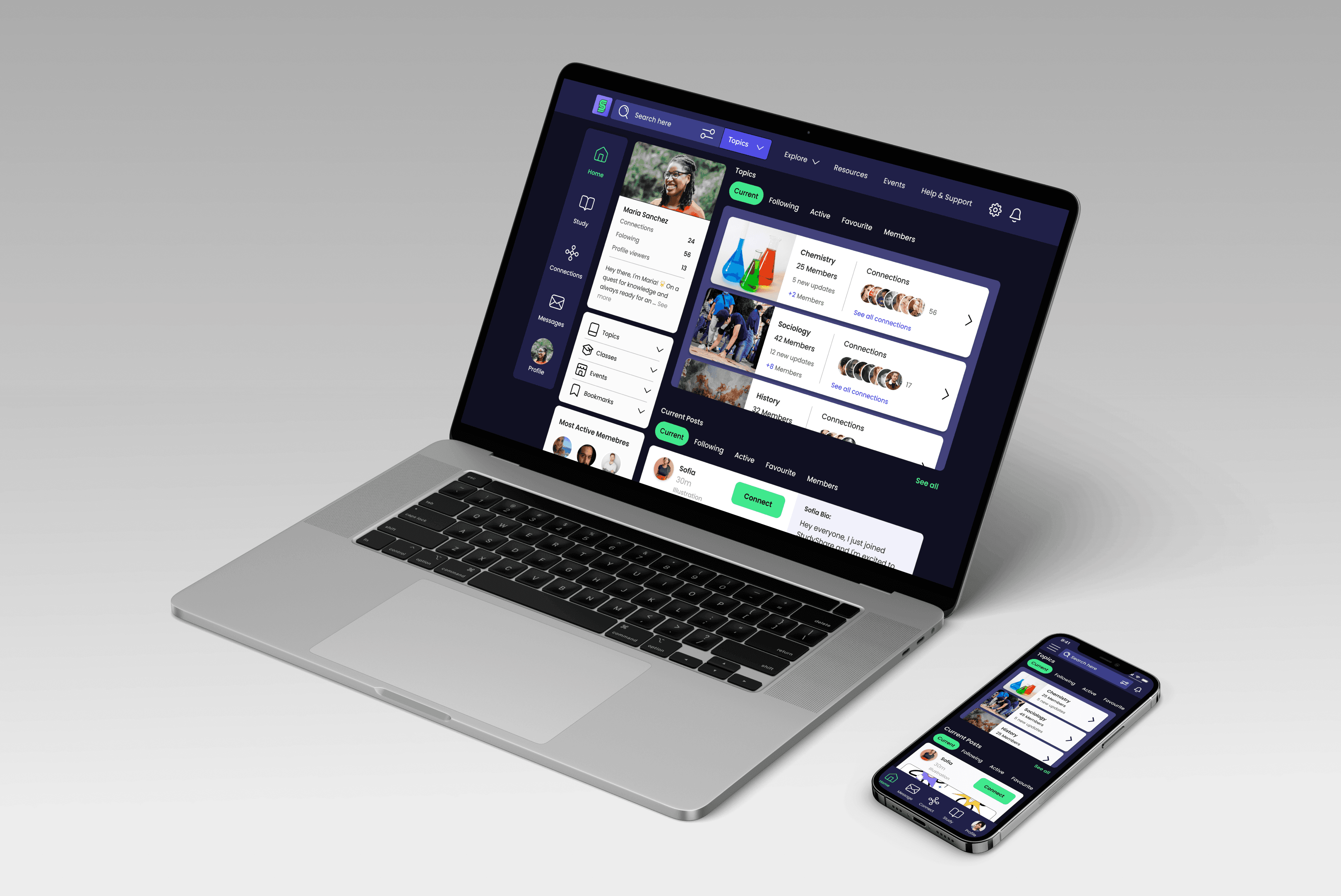
Responsive Web App
StudyShare is a collaborative learning platform designed to facilitate knowledge sharing and peer-to-peer interaction among students.
Figma, Adobe cc
Feb 2024 - May 2024
User Research, User Personas, Mood Boards, Color & Visual Design, Design Patterns, Style Guide, Wireframes & Prototypes, Responsive Design, Mock-Ups
Project Overview
Backround
Enthusiasm enhances learning. Peer interaction boosts motivation, making learning dynamic. StudyShare web app connects students for discussions, knowledge sharing, peer feedback, and collaboration. It's ideal for students juggling studies with work, family, or other commitments due to its flexible community access.
Problem
• Limited peer-to-peer learning opportunities can dampen enthusiasm and motivation.
• Difficulty in finding like-minded peers hinders collaboration and discussion.
• Accessibility issues restrict access to study resources and peer feedback.
Solution
• An engaging platform that cultivates community spirit.
• A platform for students to collaborate and share study materials and projects.
• A streamlined platform providing convenient access to resources.
Mission
Empower students through connection, collaboration, and mutual learning. Foster community spirit, engagement, and motivation. Provide easy access to resources, feedback, and collaboration for academic success.
Chaallenge
Create an accessible and responsive platform that sparks excitement and motivation without overwhelming users. Focus on organizing content effectively and maintaining a cohesive visual style. Ensure logical and intuitive content organization that accommodates diverse topics and text.
Persona
I created three user stories, including Jasmin's, to guide us as we continued the project. Drawing inspiration from these narratives, I developed our initial sketches and user flows to ensure that our designs resonated with the needs and experiences of our target users.

User Stories
I created three user stories, including Jasmin's, to guide us as we continued the project. Drawing inspiration from these narratives, I developed our initial sketches and user flows to ensure that our designs resonated with the needs and experiences of our target users.

User story
As a new user, I want to create a profile, so that other students can find me.

User story
As a new user, I want to find and connect with students studying my subject (or a related subject), so that we may collaborate.

User story
As a frequent user, I want to be able to message other students, so that we can problem-solve together.
User Flow
In crafting multiple user flows based on our user stories, I aimed to provide a comprehensive overview of the steps our personas, like Jasmine, undertake to achieve their goals. I prioritized key principles such as Descriptive Naming, One-directional Progression, and Focus on Singular Goals to ensure an optimal user experience.

Low to Medium Fidelity Wireframing and Prototyping
After outlining the initial user flow, I gained a comprehensive understanding of the steps and screens required for the design. Now, it's the opportune moment to commence with sketches and initiate the design ideation process through low-fidelity wireframes.


Layout & grid system
In developing the "Study Together" app, I used a 4-column grid system with an 8px gutter and 16px margin. This setup ensured a structured layout, enhancing usability and visual appeal. The grid allowed for balanced content distribution, crucial for peer-to-peer learning and collaboration.
This system enabled responsive layouts across various devices, maintaining a cohesive user experience. It also streamlined the creation of wireframes and mockups, ensuring alignment with our overall visual strategy.
Number of columns : 4
Gutter : 8px
Margin : 16


Integrating UI elements and patterns
After deciding on the system for the layout, it was time to make decisions about implementing UI patterns. I dedicated a section to researching and implementing suitable UI patterns.
Starting with initial wireframes, I analyzed the needs of our existing screens and user flows to identify patterns that would enhance the user experience and simplify the interactions
Date Picker Modal
Integrate a modal window for date picking that slides out from the bottom. This pattern ensures users can easily select dates without navigating away from their current screen, maintaining a smooth and intuitive workflow.

Scorable Toggle Tab
The scrollable tab facilitates the filtering of topic cards, enhancing user navigation and allowing easier access to different topics based on relevance or preference.
Vertical Scrollable Topic Cards
Integrated the cards within a vertical scrollable window, the topic cards ensure efficient content organization and easy accessibility for users. This layout optimizes screen space while providing a visually engaging and intuitive browsing experience.

Switch Tab
On the Connection screen, I introduced a toggle button enabling users to switch between the "Following" and "Connections" screens.

Modal window
The decision to incorporate a modal window with a bottom slide-out feature for new post entries on the topic screen.
This design choice ensures clear visual separation, signalling a shift to a different task without disrupting the overall layout.

Moving towards higher fidelity and
refining design patterns
After establishing the basic layout, I focused on the main user flows to identify and address any issues or pain points. My aim was to streamline the process, enabling users to achieve their goals more efficiently. By analyzing these interactions, I sought to find patterns that could enhance the flow and improve the usability.
User Story
As a new user, I want to create a profile, so that other students can find me.
• Frustration with the search functionality and long lists.
• Difficulty locating themselves through the account creation process.
• Lack of options to customize their interests.
• Need for a simpler way to indicate interests for content recommendations.
• Search Autocomplete: Enhances the user search experience.
• Input Chips: Simplifies data entry and selection with compact, interactive elements.
• Slider Bar: Allows intuitive selection and adjustment of values within a range.
• Step Indicator: Tracks progress, providing visual feedback.
• Cards: Presents content and actions in an organized, condensed format.
User Flow
Creating an account


User Story
As a new user, I want to find and connect with students studying my subject (or a related subject), so that we may collaborate.
Problem
Design Solutions
• Toggle switch: Represents binary states and allows users to make a choice.
• Radio buttons: Enables users to select from a list of options and indicates exclusivity.
• Cards: A versatile way to present content and actions in a condensed format.
• Chips: Provides a compact representation of entities, attributes and actions.
• Horizontal tabs: Organizes content into distinct sections for efficient navigation.
• Filter & sort: Facilitates the management and organization of large volumes of content.
User Flow


Creating a mood board to set the
tone and feel of the app.
I initiated the process with a comprehensive brainstorming session to envision the specific mood that the app should convey. To reinforce these concepts, I meticulously developed a mood board a visual collage of images and colors that precisely encapsulated the desired atmosphere.

Strategic color psychology:
Elevating emotional design in UI
In order to gain clarity, I conducted an analysis of competitors and delved into emotional design principles. This involved understanding the psychological impact of color on user perception.
This exploration provided me with valuable insights, enabling the creation of an interface that not only pleases the eye but also connects with users on a deeper emotional level.
Color pallet
Color harmony
Analogous
Our app's design is anchored in an analogous color scheme, prominently featuring green as the accent color and blue as the secondary color. This deliberate choice is guided by several key considerations:
Visual Harmony: Leveraging an analogous color scheme, our app seamlessly transitions from green to blue, creating a visually cohesive experience.
Psychological Impact: Green embodies growth and harmony, while blue instills trust and tranquility, aligning with our educational focus.
Accessibility and Readability: Ensuring strong contrast against light backgrounds, both green and blue enhance readability and user-friendly interaction.
Enhanced Engagement: Saturated tones evoke optimism and focus, fostering active user engagement with our content.
Primary
P1
HSL: 241-50-98
RGB: 249-249-253
Primary
P2
HSL: 241-52-15
RGB: 20-19-60
Secondary
S1
HSL: 241-74-60
RGB: 79-76-228
Accent
A1
HSL: 148-100-61
RGB: 55-255-147
In summary, by leveraging an analogous color scheme with saturated tones, we create an exciting and vibrant interface that captivates users while ensuring readability and accessibility.
Color palette UI integration
As I integrated our chosen color palette into the app, it was like arranging a set of building blocks. Each color had a specific role based on UI hierarchy. I observed how they directed users' attention and highlighted important elements. With each tweak, the app's visual organization became clearer, helping me refine the palette for better usability.


At this stage of the project, I prioritized creating a style guide, understanding its pivotal role in establishing a cohesive design language. It's always a crucial step for me in maintaining consistent design throughout the development process. My goal was to maintain clear standards and guidelines that could be referenced, updated, or altered as needed.
Logo
Logo Usage
• Ensure the logo is consistently displayed in a visible and prominent position across all digital platforms.
• Maintain the integrity of the logo by refraining from distorting, altering, or manipulating
• Use the logo consistently to reinforce brand identity and recognition.
App Icon
• Design the app icon to be scalable for different screen sizes and resolutions.
• Maintain the logo's integrity by avoiding distortion, alteration, or manipulation.
• Use the logo consistently to reinforce brand identity and recognition.
Typography
Our typography section emphasizes the importance of using the Poppins font family consistently throughout the app. Poppins offers a modern and clean aesthetic, making it ideal for enhancing readability and maintaining visual coherence across different screens and devices.

Typography Scale Integration

Colors
Our typography section emphasizes the importance of using the Poppins font family consistently throughout the app. Poppins offers a modern and clean aesthetic, making it ideal for enhancing readability and maintaining visual coherence across different screens and devices.


Visual Harmony
Analogous color schemes use colors next to each other on the color wheel, creating a smooth transition from green to blue in the app for a harmonious look.
Psychological Impact
Green represents growth, freshness, and harmony, ideal for our educational app's focus. Blue conveys trust, stability, fostering reliability and calmness for users.

Iconography
Accessibility
Ensure that icons are accessible to users with visual impairments by providing alternative text descriptions or utilizing other accessibility features.
Consistency
Ensure that all icons adhere to a consistent design style, such as a two-stroke line format, to maintain visual coherence throughout the app.
Scalability
Design icons to be scalable across different screen sizes and resolutions without losing clarity or legibility.
Clarity
Emphasize simplicity and clarity in icon design to facilitate quick recognition and intuitive interpretation by users.
Grid-based Design
Utilize grid-based design principles to ensure precise alignment and spacing of icon elements for a clean and polished appearance.

Sizes: (Informational)28-32px
(Actionable)42px
Padding: 2px
Line strength: 2-3px
Color: Black
Lines end points: Round
Informational
Filter
Actionable
Default Status bar icons
Home
Study
Connections
Messages
Profile
Setting
Notification
Active Status bar icons
Components
Atomic Design Principles
Follow atomic design principles to define UI components at various levels of abstraction: atoms, molecules, organisms, templates, and pages. Define atoms as the smallest, indivisible elements of the UI, such as buttons, inputs, and icons, and build larger components by combining atoms into molecules and organisms.

Buttons

Cards

Modal Windows


Modal Window Guidelines
Modal windows in our app serve to provide focused interactions and prompts without navigating away from the current context. We utilize two types: user-initiated and system-initiated.
User-Initiated Modals
User-initiated modals are triggered by user actions for tasks like form submissions or settings adjustments, designed to complement the user’s workflow without interruptions.
System-Initiated Modals
System-initiated modals are triggered by events like alerts or notifications, feature a distinct design from user-initiated modals, and provide critical information or require acknowledgment to proceed.
Modal Styles
Fullscreen: Overlay the entire screen for user attention. They are used just for system initiated modals.
Overlay: Display on top of the current content without obscuring it entirely.
Overlay Modal

Full Screen Modal

Other Components

I focus on responsive design and breakpoints for UI and responsive web applications, tailoring different breakpoints for desktop, large tablet, and mobile devices. From a UI perspective, I optimize layout, typography, and interactive elements for specific screen sizes, using more spacious layouts with multiple columns for larger screens.
Mobile / Small
390px
Columns: 4
Gutter: 8px
Margin: 16px
Tablet / Medium
744px
Columns: 4
Gutter: 20px
Margin: 32px
Desktop / Large
1440px
Columns: 8
Gutter: 32px
Margin: 160px
Integrating the style guide into medium-fidelity and high-fidelity prototypes
This section outlines the integration of our style guide into both medium-fidelity and high-fidelity prototypes to ensure design consistency and cohesion. Key points include:
Responsive Breakpoints
User-initiated modals are triggered by user actions for tasks like form submissions or settings adjustments, designed to complement the user’s workflow without interruptions.
Optimized Layout
User-initiated modals are triggered by user actions for tasks like form submissions or settings adjustments, designed to complement the user’s workflow without interruptions.
Mobile

Tablet

Desktop

Mobile

Tablet

Desktop

StudyShare


Learning Across Devices
The Responsive App Experience


prototypes