Responsive Web App
Rooftop Films
Rooftop Films is a New York-based non-profit that hosts outdoor screenings of independent films, alongside live music events, while supporting emerging filmmakers with grants and resources.
My role
UX/UI Designer
Tools
Figma, Optimal Workshop
Scope
August 2024 - Ongoing
What I did
User Research, Information Architecture, Usability Study, User Personas, Wireframes & Prototypes, Responsive Design
Project Overview
Background
Rooftop Films is a New York-based non-profit film festival known for its unique outdoor screenings of independent films and live music events. The festival combines cinema with the city’s landscape, hosting events at various urban venues to create immersive cultural experiences. As a UX designer contracted to consult on this project, my primary goal was to identify key usability issues and present solutions that could be implemented. I aimed to showcase 2/3 user flow improvements to stakeholders, highlighting what can be done to enhance the user experience.
Brief
Enhance the website’s user experience to better showcase Rooftop Films' core elements by addressing key pain points and usability issues. Ensure all users can quickly and easily access vital festival information across various programs and sections, while minimizing confusion.
Problem
Users experience friction when navigating between different sections.
Switching between festival elements is not intuitive, causing confusion.
The lack of seamless flow hampers exploration across events, venues, and music.
Navigation issues hinder users from accessing vital information.
The mobile experience is not optimized, reducing user engagement.
Objectives
Enhance Information Structure:
Centralize and simplify access to event details, ensuring that users can effortlessly find schedules and descriptions for different areas such as music, screenings, venues.
Improve the user flow:
Ensure seamless navigation across key festival sections such as screenings, music events, and venues, improving user interaction and reducing friction.
Responsive Design:
Enhance mobile navigation to allow quick access to event information on the go, as many attendees check details via their phones.
Mission
The mission for this project was to redesign the Rooftop Films website, streamlining access to key information and enhancing the user flow across main festival sections.
Challenge
One of the biggest challenges was unifying the core sections of the festival—screenings, music events, and venues—into a single, cohesive experience. Users struggled with navigating between these sections, often encountering friction when switching from one to another.
In my design journey, the Double Diamond Strategy has served as my guiding framework, helping me navigate project complexities while balancing creativity and strategic focus. I began by researching and understanding Rooftop Films' users, exploring their experiences, challenges, and concerns with the website, as well as attending events.

Discovery
• Competitive Analysis
• Heuristic Analysis
• User Research
Define
• Problem Statement
• User Persona
• Site Map
• Card Sorting
• A/B Testing
Develop
• Sketches
• Wireframes
• Prototypes
• Usability Testing
Deliver
• Interactive Prototypes
• Design Handoff

Competitive Analysis
My focus at this stage was primarily on evaluating navigation, usability, and layout. Additionally, I performed a SWOT analysis, with my goal being to improve and redesign the platform. I concentrated mainly on the strengths and opportunities identified during this process.
Heuristic Evaluation
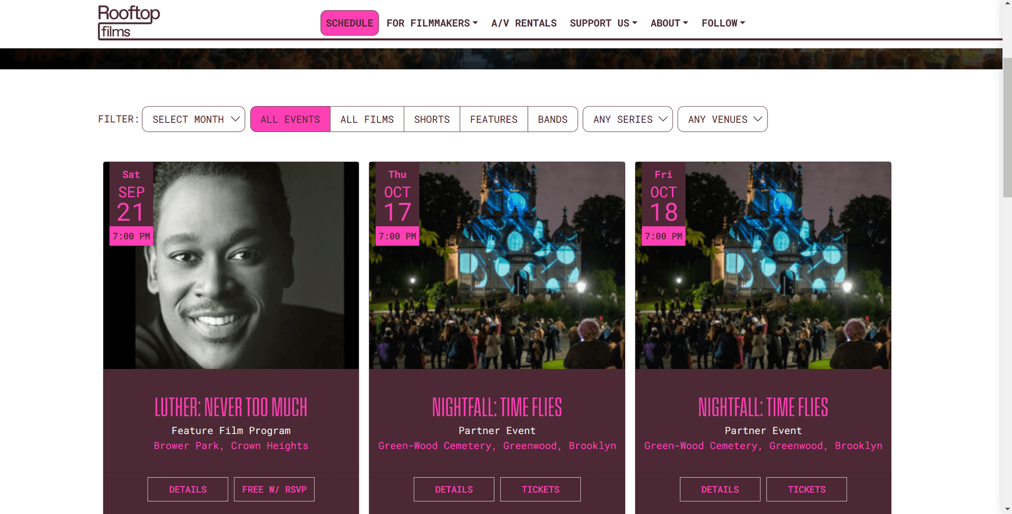
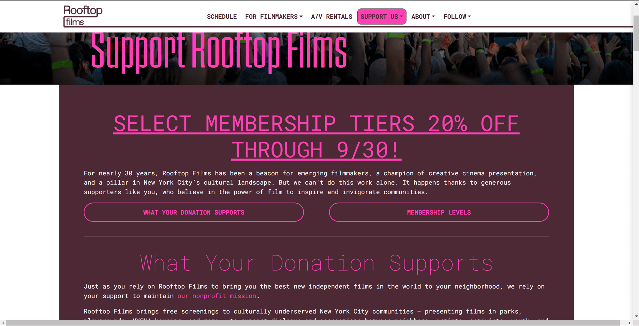
I began the usability study by thoroughly evaluating the current website, focusing on user interactions, identifying pain points, and assessing overall functionality.
Usability Issues
Lack of differentiation between festival categories
Key sections of the festival, such as film screenings, special events, and workshops, are not clearly differentiated. There are difficulty navigating between different festival categories, such as films, music events, and venues. The lack of a streamlined navigation system caused confusion and hindered the user experience.
Solution
Implemented a more efficient navigation structure, adding clear labels and category-specific filters to help users easily switch between festival categories like films, music, and venues.
Labeling issues causing user confusion
Some of the labels used on the website, such as for navigation links or action buttons, are either ambiguous or not clear.
Solution
Conduct user testing on labeling systems and update link texts and button labels to be more intuitive and task-oriented. For example, instead of “Info,” use descriptive terms like “Film Details” or “Event Overview.
Layout and information overload
Some pages on the website have a cluttered layout, presenting too much information at once without clear visual hierarchy. This overwhelms users, especially on event or film listing pages.
Solution
Simplify page layouts by applying principles of whitespace, grouping related content, and creating a clear hierarchy.
Search functionality issues
The lack of an effective search feature makes it difficult for users to quickly find specific films, events, or information about the festival.
Solution
Implement a more robust search engine with advanced filtering options. Allow users to search by film name, genre, date, or event type.
User Interviews
Following our meeting and the information provided, I knew it was the right time to conduct user interviews get to know the users, in order to gain a deeper understanding of their needs and the challenges they face.
Interview Goals
Identify User Needs
Understand the specific needs and expectations of users regarding the website and its features.
Uncover Pain Points
Gather insights on usability issues and challenges users face while navigating the site, helping to identify areas for improvement.
Content Engagement
Understand how users engage with content and navigate the information structure to optimize accessibility and interaction.
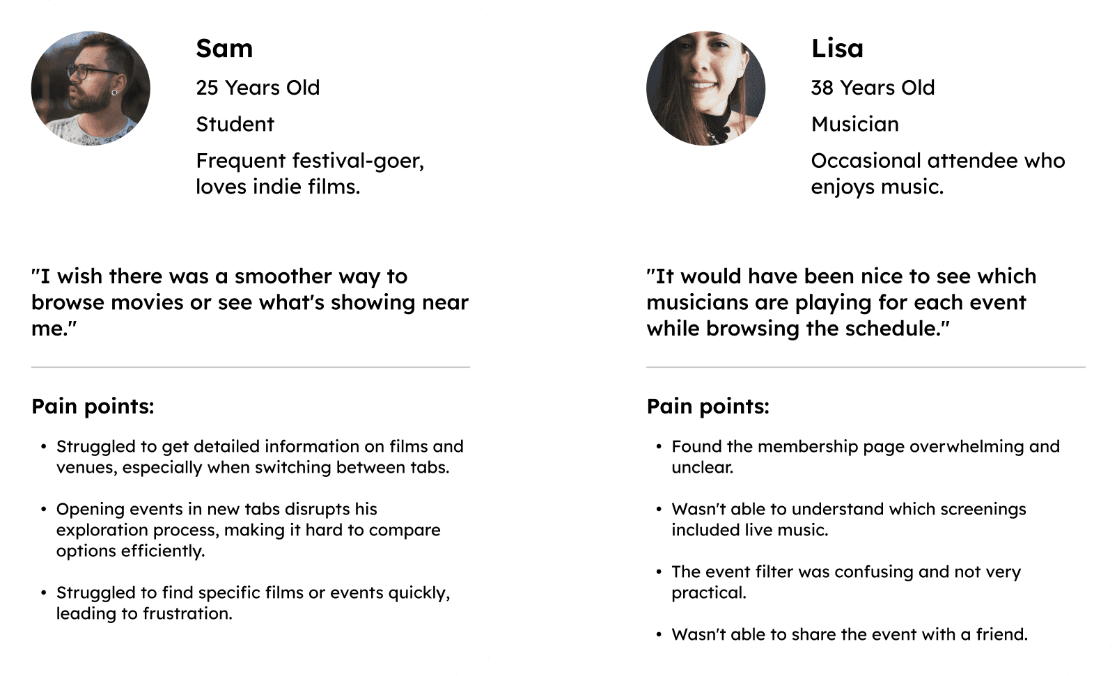
key Takeaways

User Persona
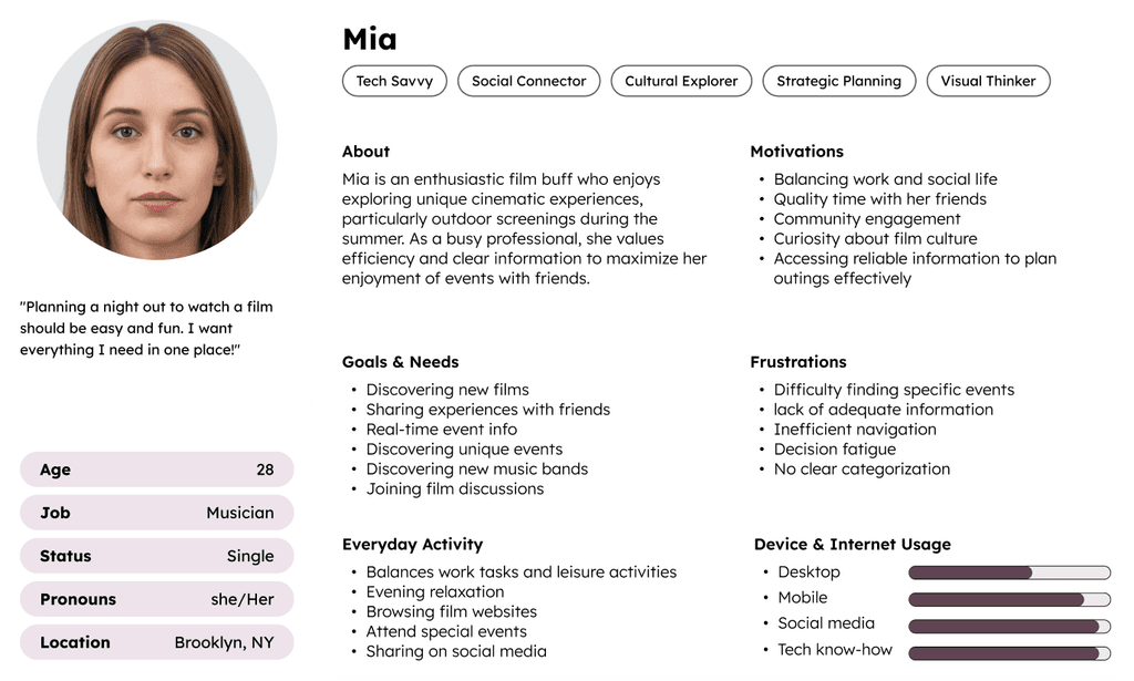
After the findings phase, I created proto personas based on previous festival data and insights from recent interviews. This allowed me to capture diverse attendee needs and preferences, guiding the development of user-centered prototypes. The goal was to enhance engagement and accessibility for future Rooftop Films events.
User Flow
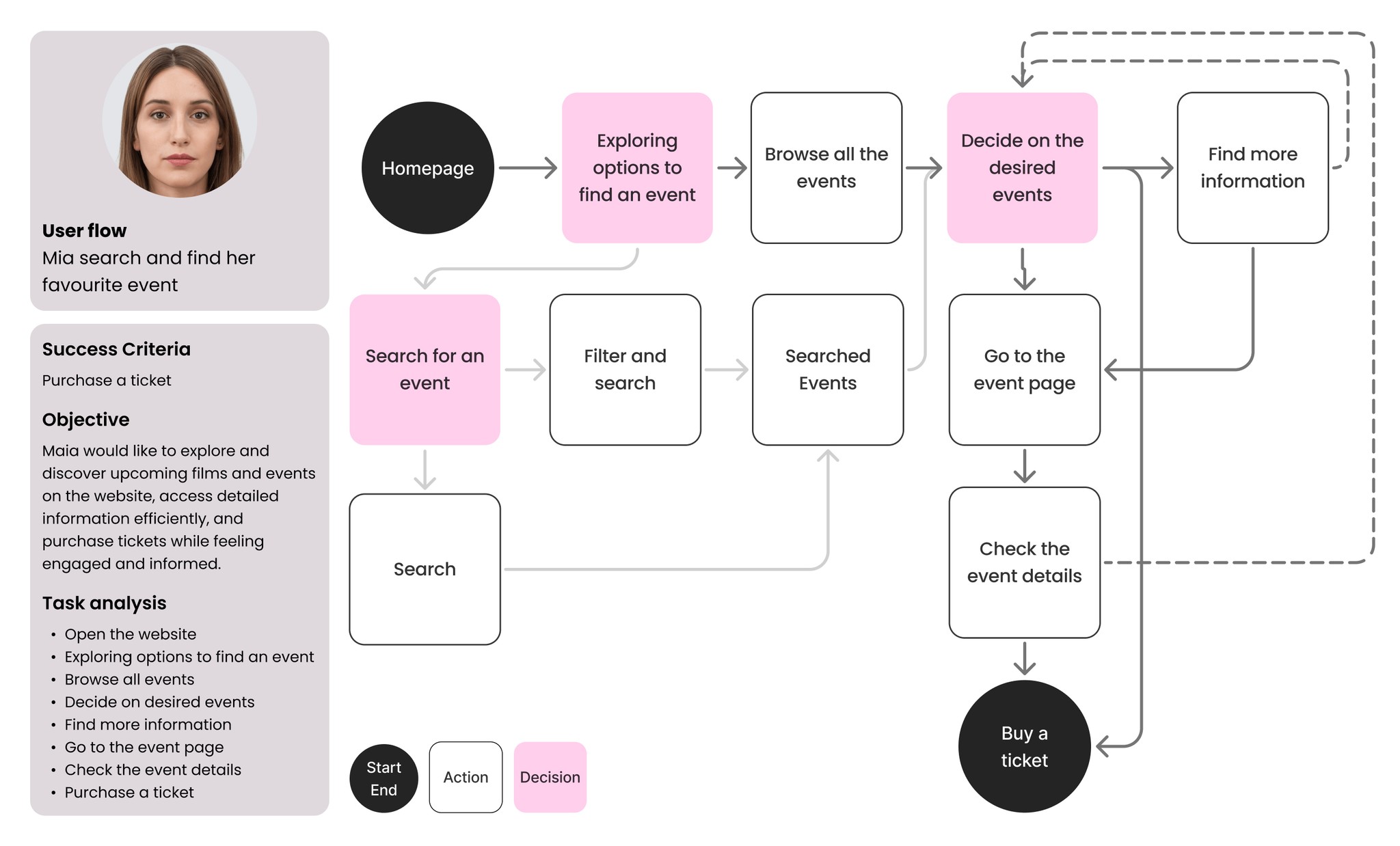
In this phase, I focused on developing the first user flow centered around events and information access for attendees. This flow aimed to provide a clear path for users to obtain essential details about screenings, music events, and venues.
Streamlining Navigation: Redesigning the Site Map
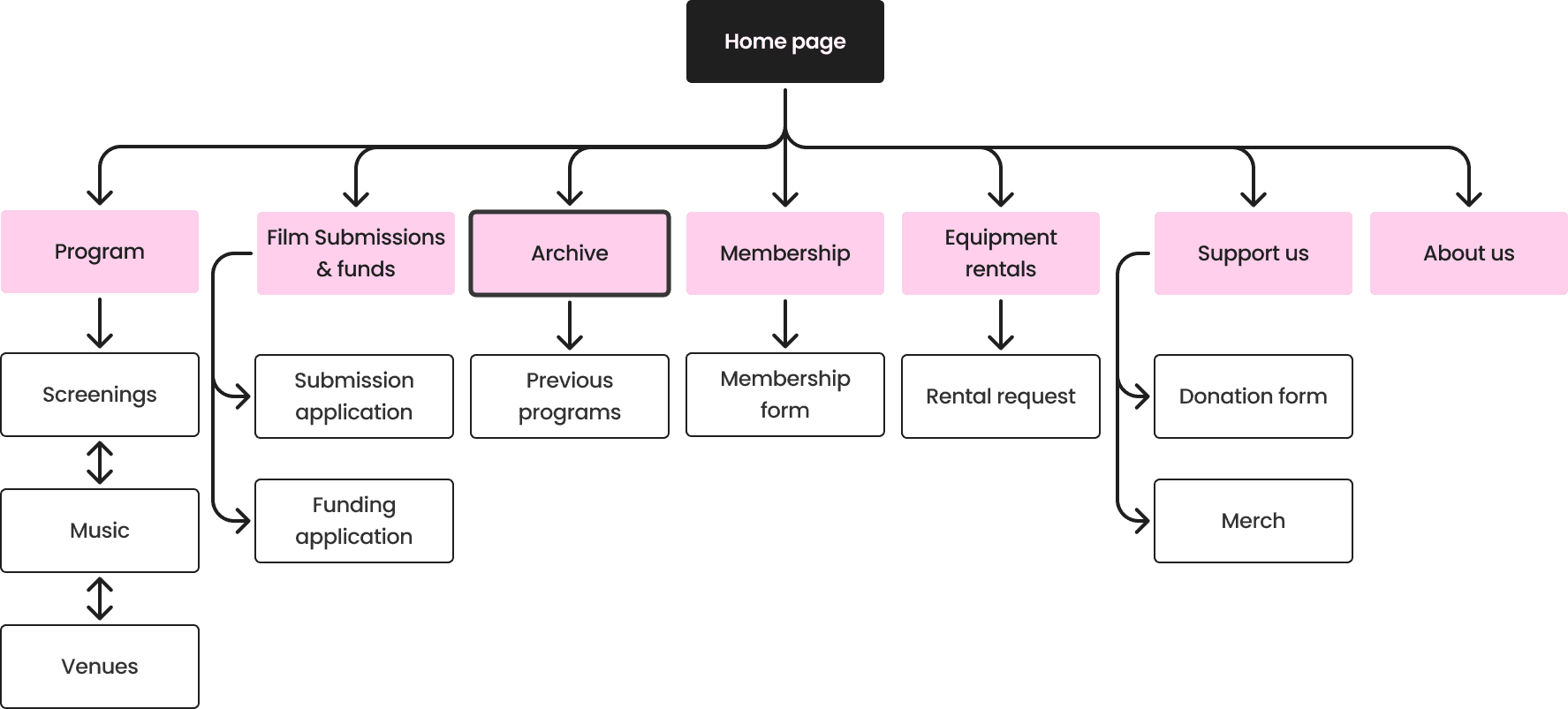
After developing the initial site map, I initiated a conversation with a key stakeholder to ensure we were aligned with the overall goals of the platform. During our discussion, I identified that grouping all programs—past and present under one section was creating unnecessary clutter and confusion for users.
I proposed introducing a new archive page to separate past programs from current ones. This approach not only improved navigation but also enhanced the user experience by allowing easy access to previous events without overwhelming the main event section.
Redesigning the Program Section
In the next steps, I shifted my focus to the program section, which was the main emphasis of my consultation for Rooftop Films. Understanding that this section serves as a crucial hub for users to access information about live music, venues, and film screenings.
Program Section
After this, I began identifying all the key information that needed to be included in this section. I organized this data to create a comprehensive map that would guide the development stage, ensuring that essential details are easily accessible and logically structured for users.

Initiating the Design Phase
As I transitioned into the design phase, I felt a surge of excitement collaborating with the Rooftop Films team. They were open to refreshing their visual identity, which provided me the creative freedom to weave in all the key information we had gathered. This collaboration was essential in shaping a design that not only reflects the festival's vibrant spirit but also allows users to effortlessly find all the necessary details about live music, venues, and film screenings.
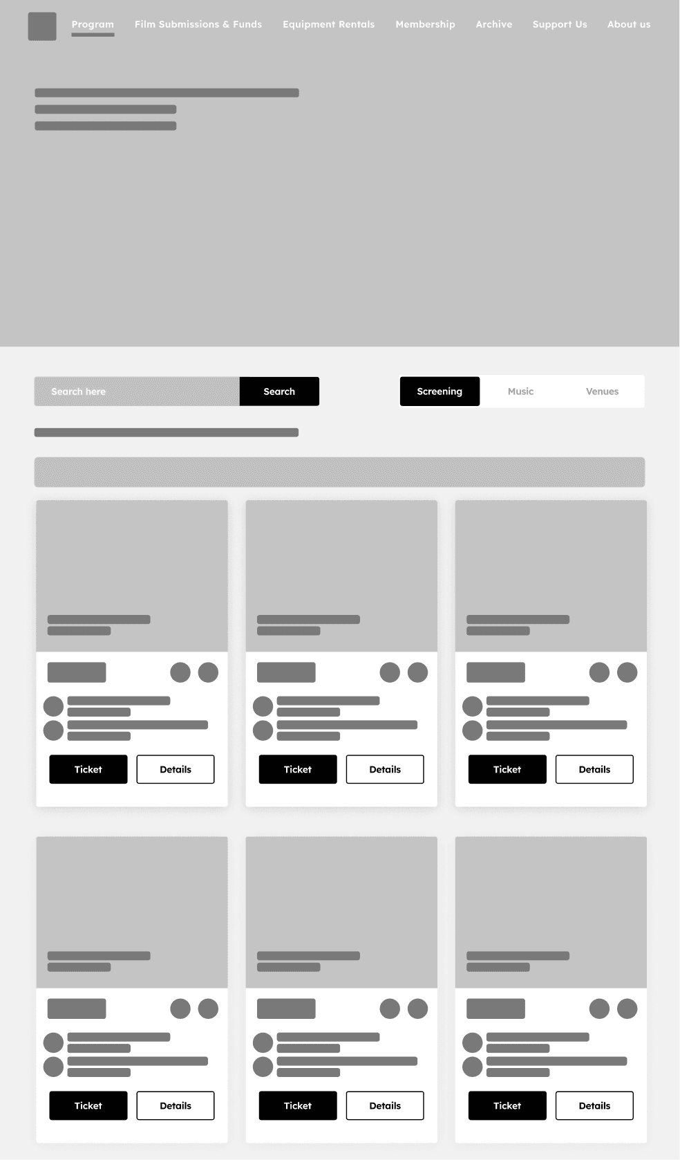
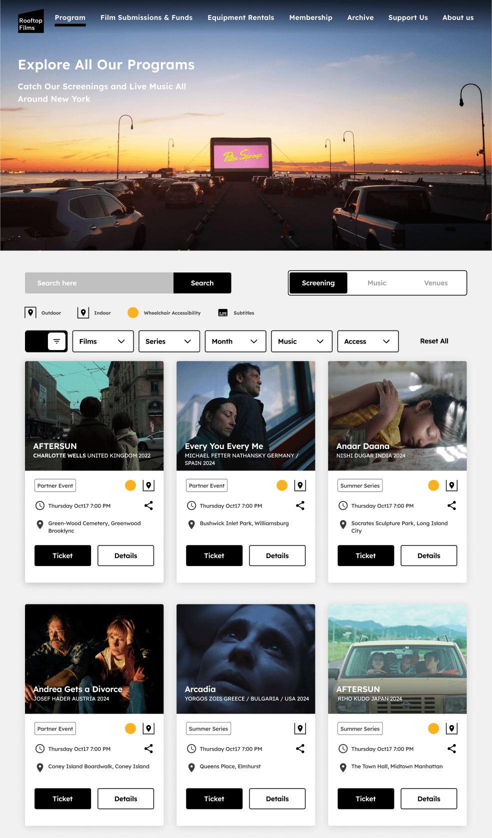
Utilizing Card Sorting and A/B Testing
Throughout the design and validation process, I used card sorting and A/B testing to improve the navigation and labelling on the program page. These methods helped me refine the structure of key categories like Screening, Music, Venues, and Access options. By testing different labelling approaches and user flow structures, I gained better insights into our user pain points and mental models.
User-Centric Improvements
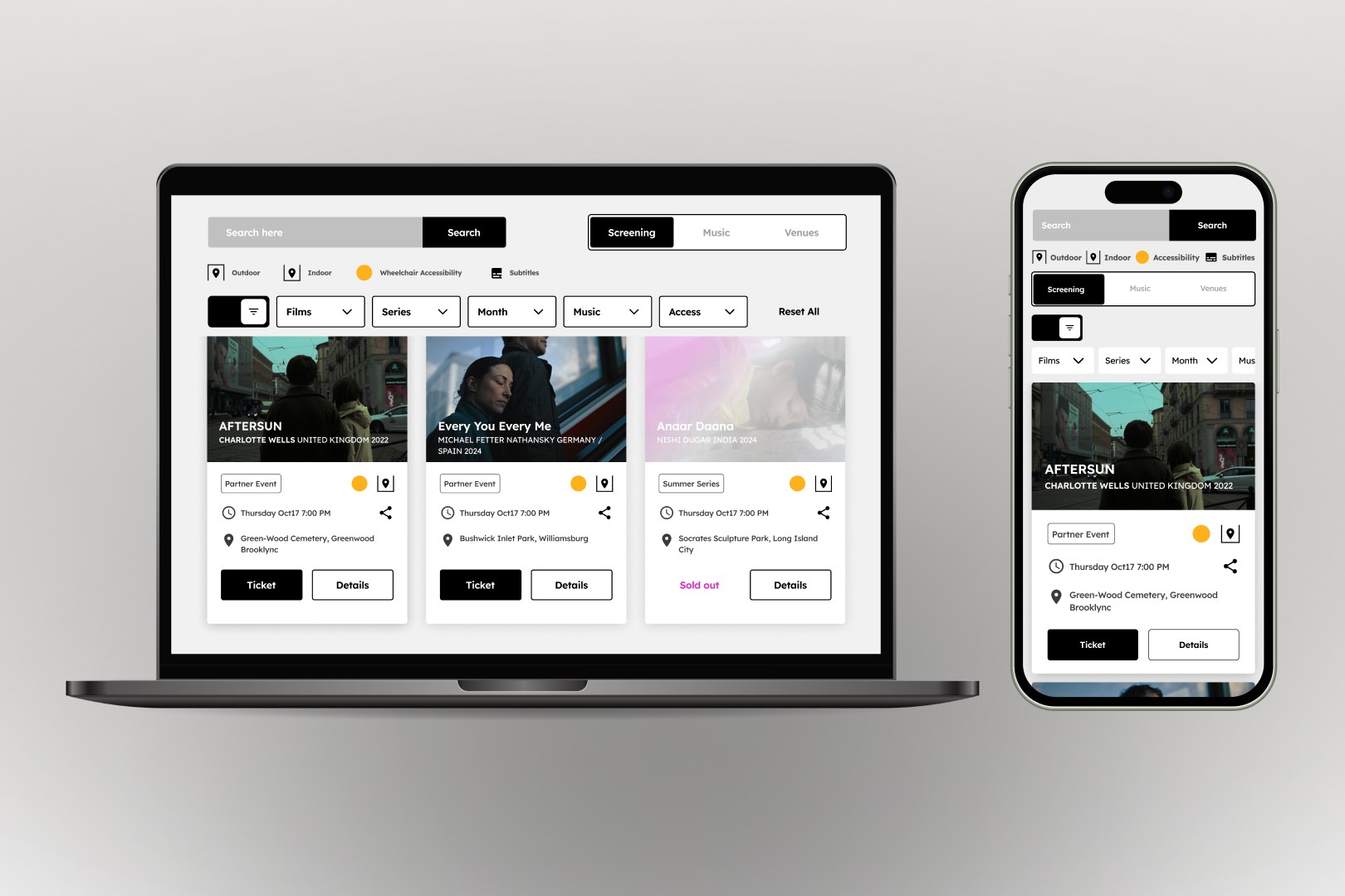
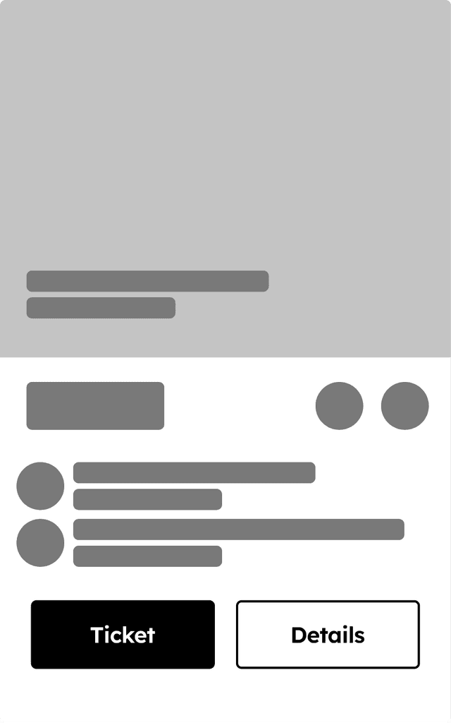
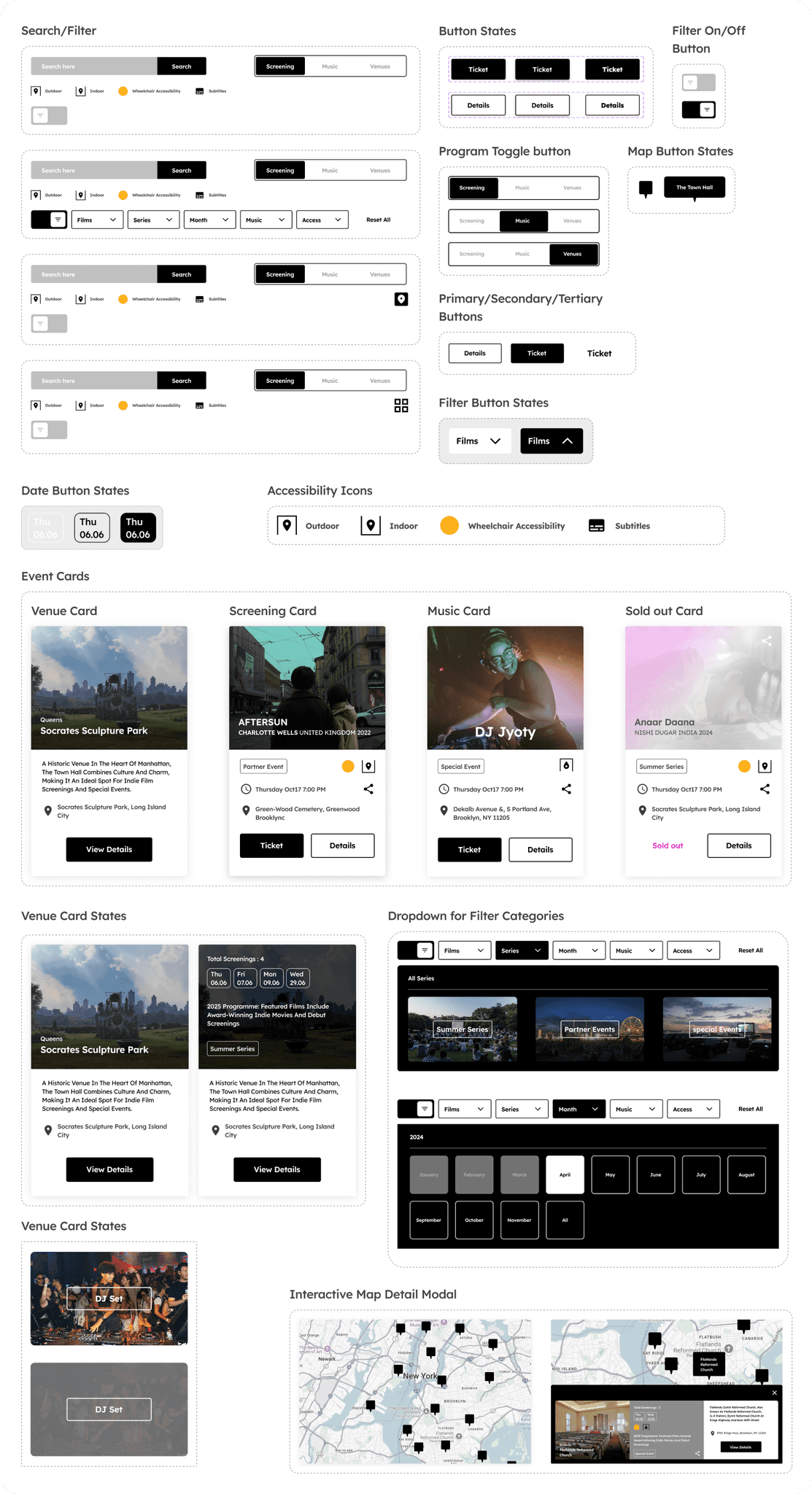
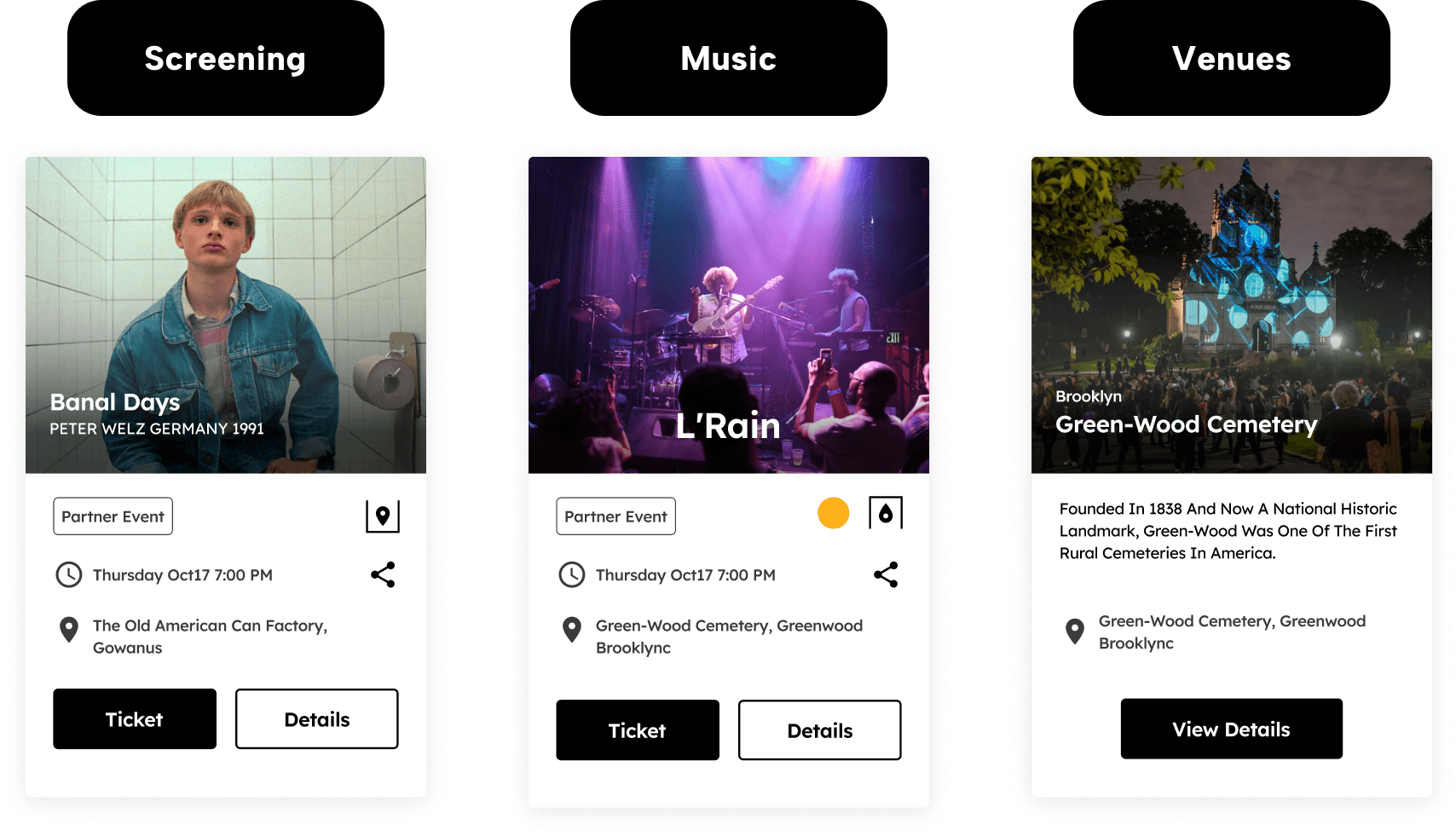
The main update that prompted a reevaluation of the site map was changing the toggle options to Screening, Music, and Venue, along with adding an interactive map feature to the venue page. This new structure better matched user expectations and effectively highlighted the festival's core elements. Additionally, I restructured the filter buttons based on user feedback.
After discussing my findings with Rooftop Films, I decided to create a new archive category for previous years, which introduced a separate user flow to avoid clutter in the main program section.
Before user testing
After user testing
Moderated Usability Testing
Listening to Users to Refine the Design Experience
As part of the design process, I conducted usability testing to gather direct feedback from users. This testing allowed me to identify pain points in navigation helping to refine the user flow and improve the program page's usability.
Usability Testing Objectives
Evaluate Navigation Efficiency: Assess how easily users can navigate through key sections like Screening, Music, and Venues, and access essential event details.
Identify Pain Points: Uncover any areas of confusion or friction in the user journey, such as difficulty filtering options or accessing information.
Measure User Satisfaction: Gauge overall user satisfaction with the design, focusing on how well the site meets their needs in terms of accessibility and usability.
"I feel like I’m jumping around too much between music and film screenings. It would be great if I could see everything in one place."
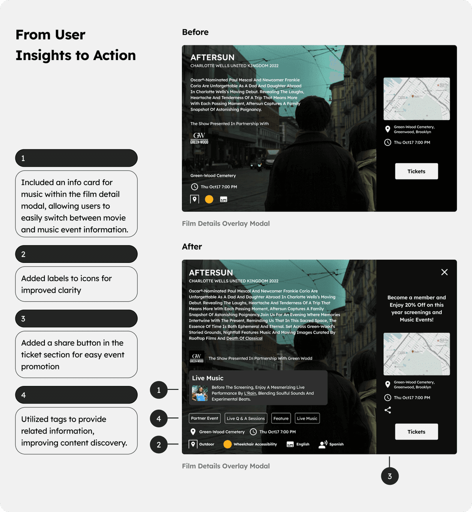
Film Details User Flow
Responsive Design
Given the short scope of the project and stakeholder priorities, which were focused more on the website, I opted for a desktop-first approach. While mobile users are important, the primary use case was not heavily reliant on mobile, allowing me to first focus on clarity and depth in the desktop design. This approach made it easier to streamline elements for mobile without sacrificing core functionality or user experience.
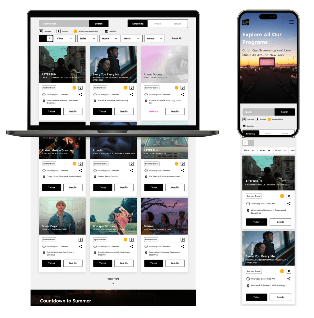
For the mobile adaptation, I didn’t just scale down the existing user flows from the website. Instead, I focused on making the mobile experience intuitive and accessible. This involved rethinking key elements to ensure users could easily navigate and interact on smaller screens, while maintaining all necessary functionality and providing a smooth experience across both platforms.
Finalizing Prototypes and Developer Handoff
In the delivery phase, I focused on preparing all the necessary components for the development team, ensuring that the transition from design to development was as smooth as possible. This involved refining the final prototypes, and incorporating all feedback from stakeholders.
Experience in Action: Crafting a Interactive Prototype
After developing the user flow, my next objective was to leverage it effectively to meet key business success criteria. Through discussions with stakeholders, I identified that their primary goals were to enhance ticket sales and membership while increasing website traffic.
To create a site map that truly addresses user needs, I conducted a thorough analysis of the product information hierarchy. This involved evaluating how we present information to users to minimize friction and ensure a seamless experience.
Video Preview of the Interactive Prototype
Challenge: Creating a User Flow that Intertwined the Festival's Key Elements
Learning: user's journey as a whole
Challenges and Solutions :
One of the most complex aspects of this project was designing a user flow that effectively intertwined the various components of the Rooftop Films Festival—namely, film screenings, music performances, and venue details. These elements are the heart of the festival, and they needed to be seamlessly connected so users could navigate between them without friction.
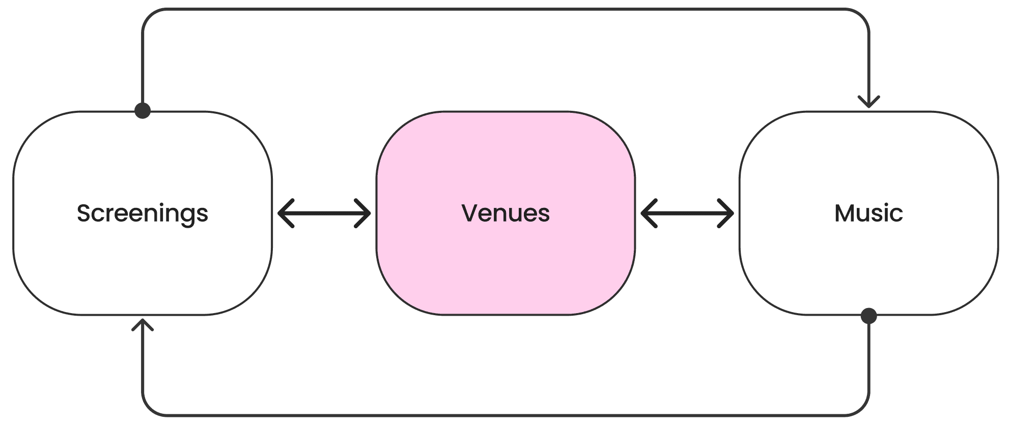
I found that many users viewed the film screenings, music events, and venues as separate experiences, but they needed to be able to move between them fluidly. To tackle this, I restructured the site map and navigation so that all three elements were more interconnected.
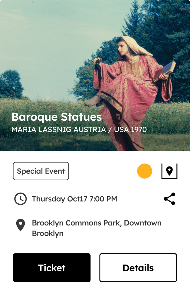
For example, when a user clicked on a film screening, they could easily view related music performances at the same venue or quickly get venue details like accessibility and directions.
Lessons Learned:
What I learned from this challenge was the value of looking at the user's journey as a whole. Instead of isolating each part of the festival experience, I aimed to weave them together in a way that reflected how users naturally explored the event.
Enhancing Navigation and Accessibility for Rooftop Films Festival
A Unified Navigation Solution for Efficient Access to Screenings, Music, and Venue sections
Before Redesigning the Website

After Redesigning the Website

Interactive Venue Map
An interactive map helps users quickly find information about different venues and their associated events, improving overall navigation.
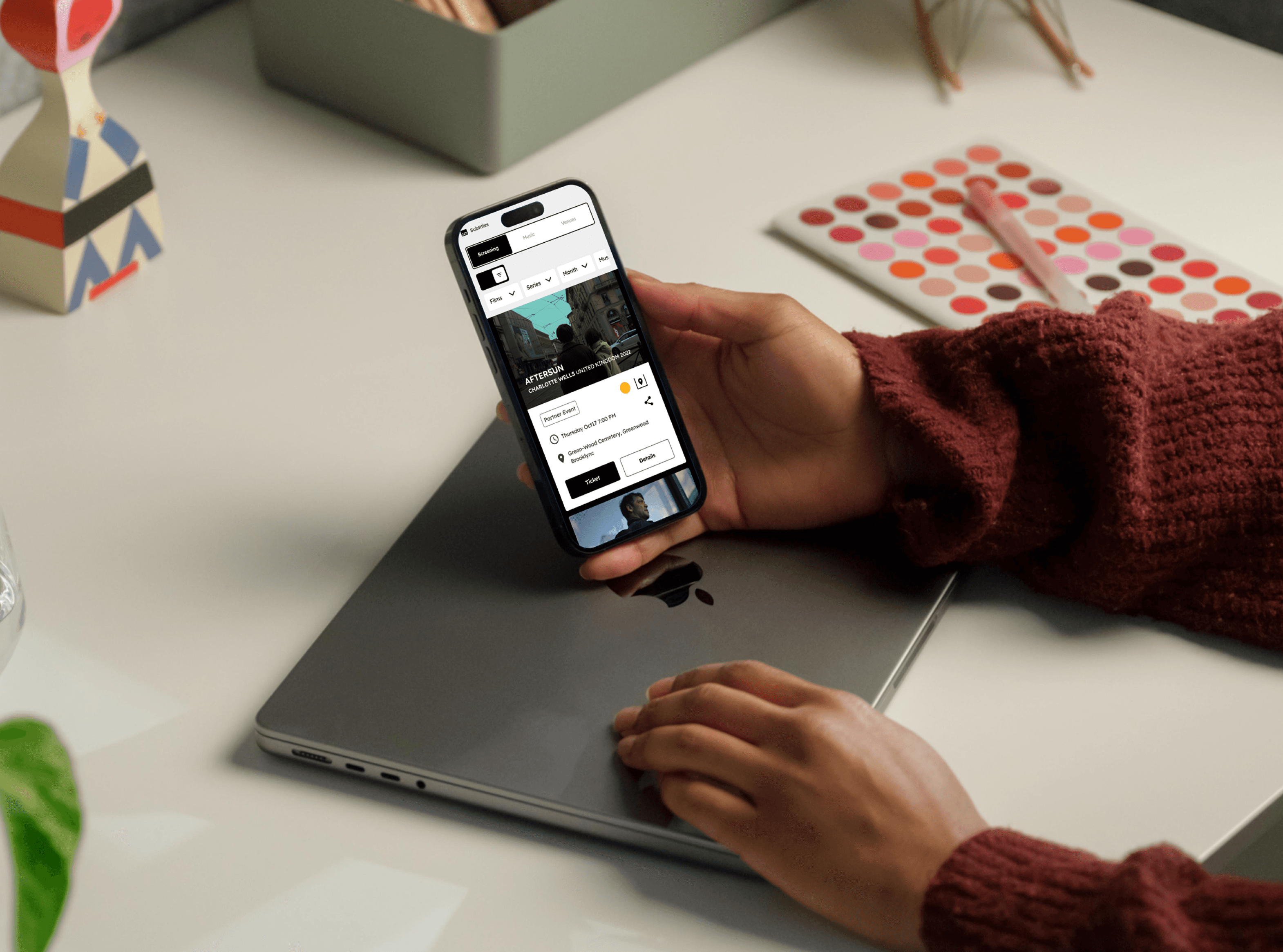
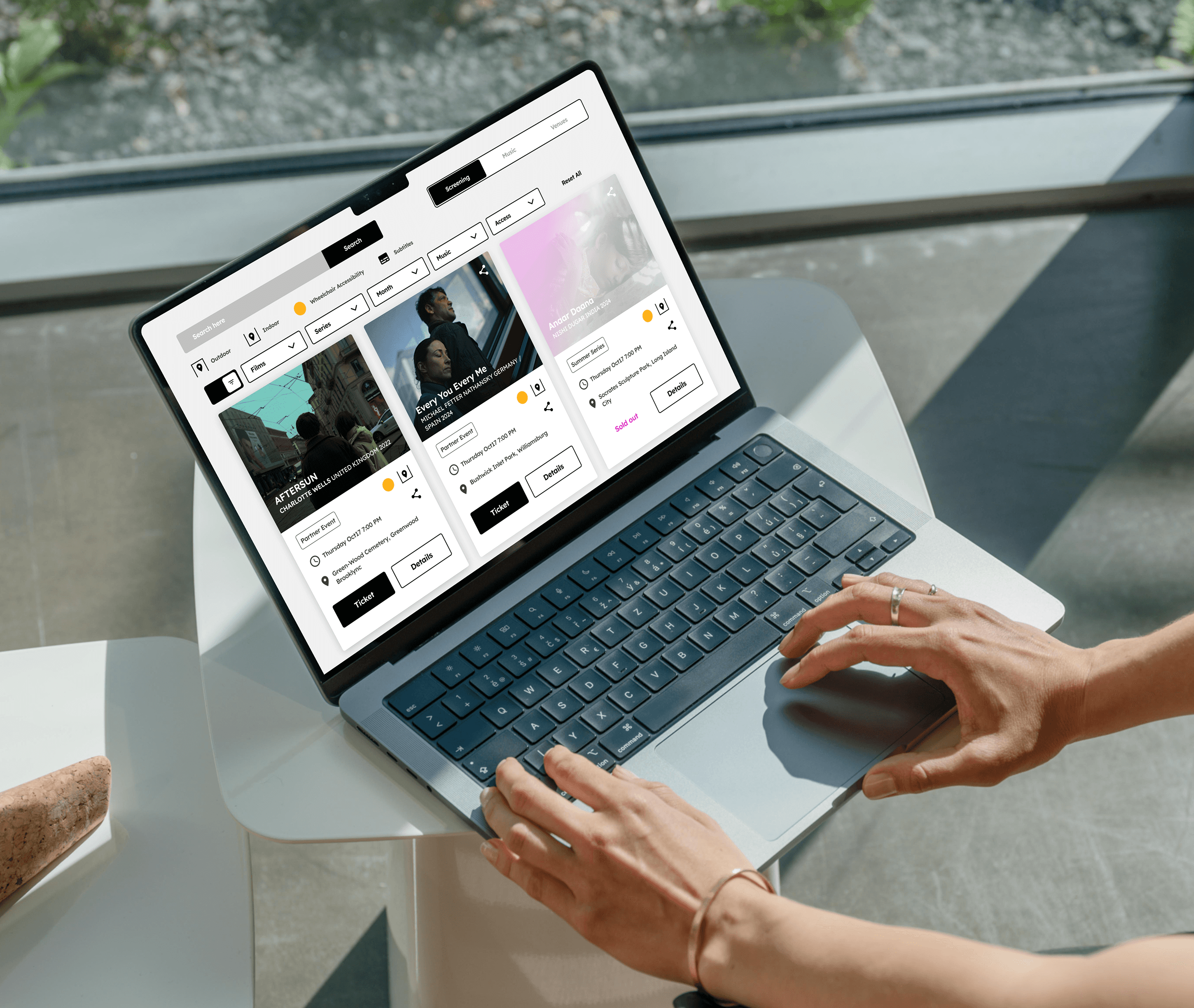
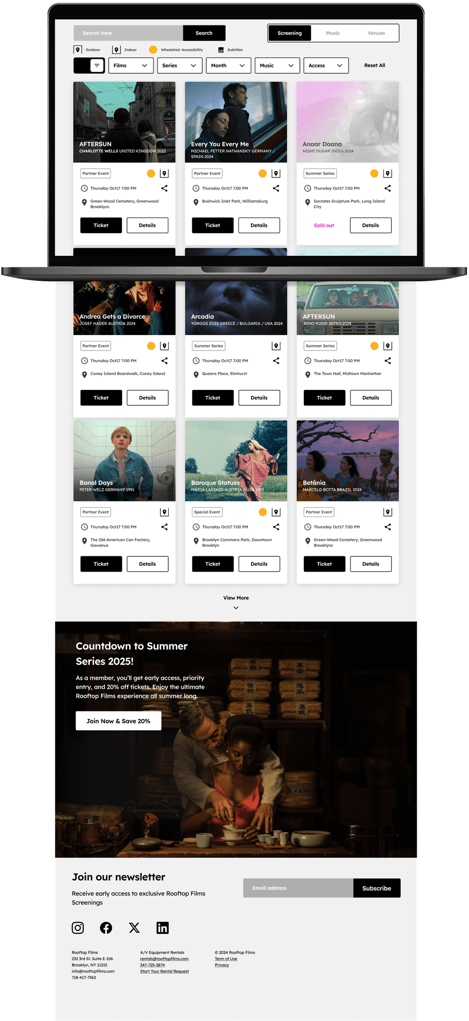
The Responsive Web App Experience
Explore Rooftop Films on any device, ensuring you can find event information with ease.
